


Design the perfect vending solution for your location and customers.

Join the VMFS newsletter and step into a thriving network dedicated to collective success.
One signup. Endless possibilities.
A branded vending machine generates brand impressions every hour it operates - whether or not a transaction happens. In a location with 500 daily foot traffic, a single well-placed machine delivers up to 15,000 brand exposures per month at zero incremental media cost.
Most operators treat branding as a visual afterthought. The businesses generating the strongest returns from custom vending machines treat it as a strategic layer - one that affects pricing power, customer trust, and long-term brand equity at the point of sale.
This guide covers every element of a vending machine branding strategy: the three levels of brand application, Pantone colour matching, screen UI design, how to brief your designer, and the mistakes that consistently undermine brand impact in the field.
Most brand channels are passive - a billboard, a social ad, a product package. The customer sees them and moves on.
A vending machine is an active brand environment. The customer approaches it, interacts with it, completes a transaction through it, and walks away having had a multi-step brand experience - not just an impression. According to vending industry data, branded machines in retail environments command 15 to 30% higher average transaction values than identical products in generic machines, because the brand environment at the point of sale changes the customer's price reference point.
This is the core commercial case for investing in branding as a strategic layer - not just an aesthetic one - when building a custom vending machine.
Effective vending machine branding operates across three distinct levels. Each one builds on the last. Brands that invest in all three consistently outperform those that treat branding as exterior decoration only.
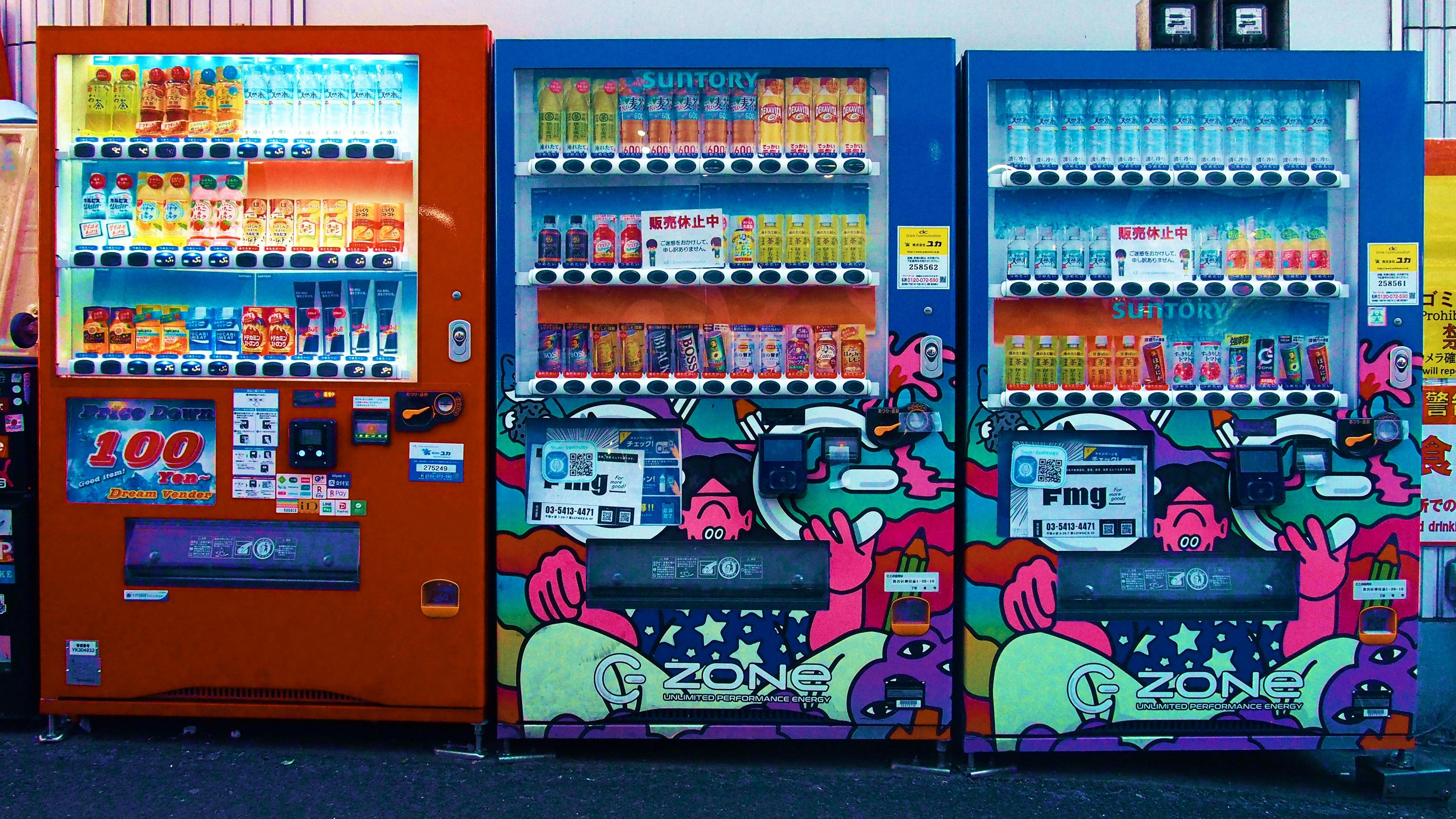
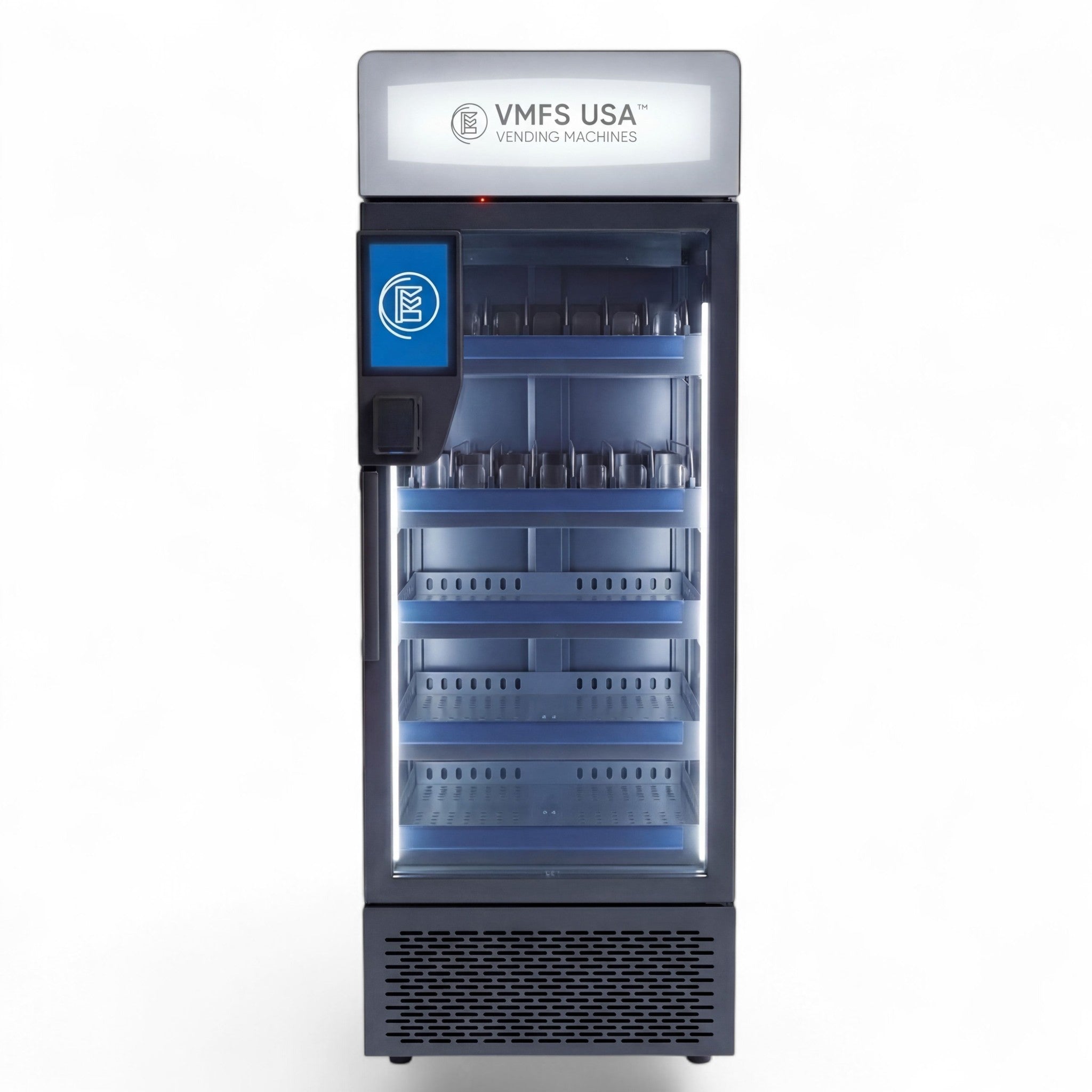
The wrap is the machine's first communication. Before a customer reads a product name or touches a screen, the exterior has already communicated brand quality, category positioning, and price expectation.
A Level 1 branding investment covers:
At this level, the machine communicates brand without requiring the customer to interact with it. This is where passive brand impressions - the 15,000 per month figure from high-footfall locations - are generated.
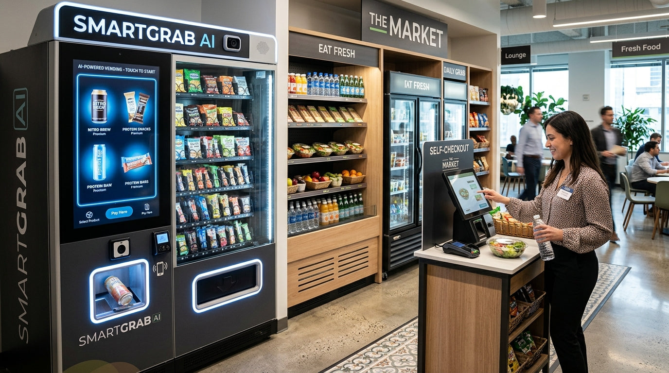
The screen is where brand identity becomes a functional experience. A customer who approaches an unbranded touchscreen interface encounters a generic software template. A customer who approaches a fully branded interface encounters the brand's visual language at every step of the transaction.
Level 2 branding covers:
Research from the digital signage industry shows that branded interactive screens at retail produce 46% higher customer engagement rates compared to static or generic interfaces. The screen is not just a transaction tool - it is a brand communication channel with a captive audience at peak purchase intent.
For brands deploying AI-powered vending machines, the screen layer extends further - serving contextually relevant brand content based on time of day, location patterns, and customer behaviour. The machine adapts its brand communication in real time rather than running a static loop.
Level 3 treats the machine as a complete brand experience rather than a product dispenser with branding applied. This is the approach used by brands for whom the machine itself is a marketing statement - not just a sales channel.
Level 3 branding covers:
Level 3 is not necessary for every deployment. It is the right investment for brands where the vending machine is a primary customer-facing brand asset - flagship retail activations, event marketing, or brand-first markets where the machine's visual presence is a competitive signal in itself.
Pantone colour matching is the single most overlooked and highest-impact decision in the vending machine branding process. Most operators discover its importance the hard way - when a wrap arrives at a location and the brand red is visibly different from every other brand asset in the space.
The Pantone Matching System (PMS) is a globally standardised colour language used across print, manufacturing, packaging, and retail to ensure a specific colour reproduces identically across every medium, every supplier, and every production run. When you specify PMS 485 C for your brand red, every print supplier, wrap manufacturer, and screen designer in your production chain works from the same measurable reference - not an interpretation of "red."
Without Pantone specification, colour accuracy depends on each supplier's calibration, ambient lighting conditions during production, and substrate material - all of which introduce variation. The result is colour drift: the machine in one location looks different from the machine in another, and both look slightly different from your packaging and marketing materials.
Brand colour consistency is not a design preference. Research published in the Journal of the Academy of Marketing Science found that consistent brand colour recognition increases purchase likelihood by up to 80%. For vending machines operating as unattended retail touchpoints - where the brand has no staff present to guide the customer experience - the visual environment created by the machine is the entire brand communication.
When that colour is inconsistent with the brand the customer already knows, the subconscious response is a reduction in perceived quality and trust - even if the customer cannot articulate why. For custom vending machines positioned in premium environments - hotels, airports, flagship retail spaces - this is a brand credibility risk that Pantone specification eliminates entirely at negligible additional cost.
For operators running fleets of custom vending machines across multiple locations, Pantone specification is the infrastructure of visual consistency. The machine deployed in one city must be visually identical to the machine deployed in another - regardless of when each was produced, which print supplier handled each wrap, or how many campaign refresh cycles have occurred between them.
For brands scaling with Seaga vending machines as their hardware platform - a well-established base frequently used for custom branded deployments - Pantone codes specified at the initial brief ensure every unit across your fleet holds the same visual standard through its entire operational life.
The quality of your branding output is directly proportional to the quality of your brief. Vague briefs produce generic designs. Specific briefs with clear constraints produce brand-accurate work that performs commercially.
| Brief Element | What to Include | Why It Matters |
|---|---|---|
| Brand guidelines document | Logo files (vector), Pantone codes, typography, colour hierarchy | Gives designer exact brand parameters to work within |
| Cabinet template files | Exact dimension files from manufacturer per surface | Ensures artwork fits correctly at print size |
| Placement environment | Location type, ambient lighting, surrounding retail context | Affects colour, contrast, and visibility decisions |
| Primary communication goal | What should the customer understand in 3 seconds? | Focuses visual hierarchy on the right message |
| Reference examples | 3-5 examples of vending or retail branding you admire | Aligns aesthetic expectations before concepts are produced |
| What to avoid | Explicit exclusions (colours, styles, competitor aesthetics) | Prevents wasted revision cycles |
Vending machines are not flat surfaces. They operate in three-dimensional space and are approached from multiple angles. Logo placement rules that work on packaging or digital assets do not automatically translate to a 6-foot cabinet.
The strongest vending machine wrap designs share three characteristics regardless of brand category:
These errors appear repeatedly across poorly performing branded deployments. Knowing them before briefing saves time, money, and brand credibility.
Brand consistency is a system problem, not a design problem. The design can be perfect - but if the production and operations infrastructure does not support it, visual drift is inevitable over time.
Every operator running more than one custom vending machine should maintain a single brand asset document that contains:
This document is what prevents brand drift. When a wrap needs replacing - whether due to wear, a campaign update, or a new location - the replacement is produced from the same brief as the original.
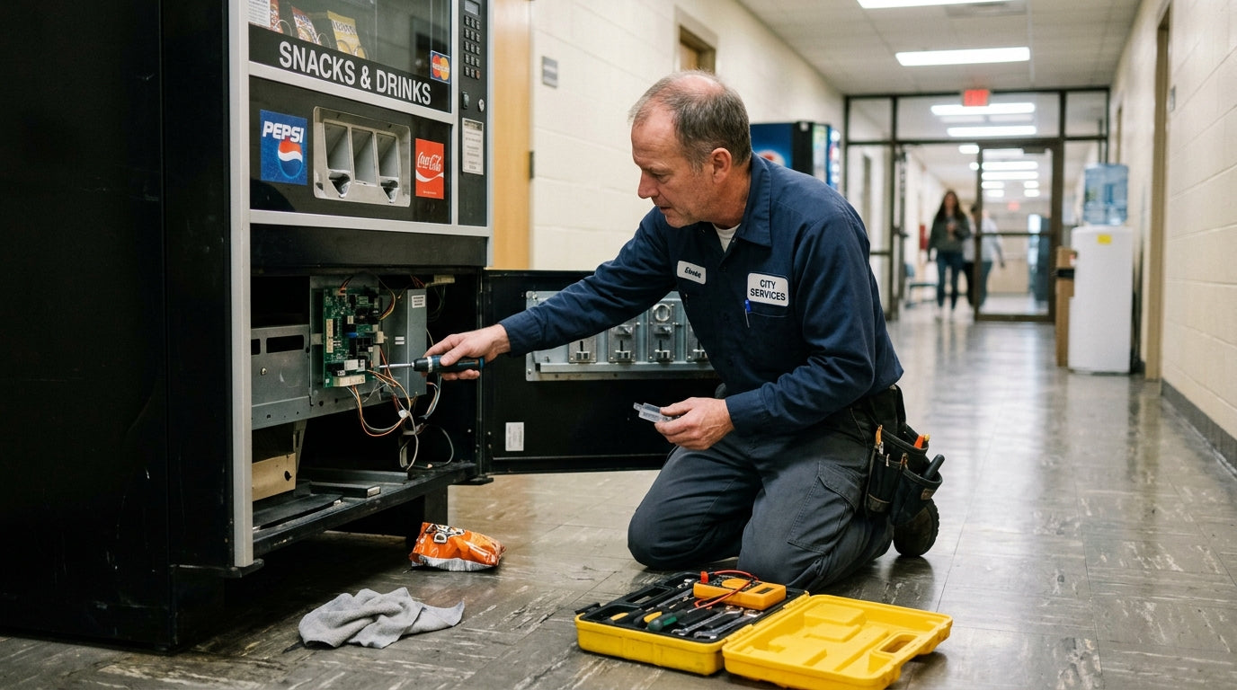
Commercial vinyl wraps in high-traffic environments have a typical service life of 2 to 4 years. A scheduled wrap refresh programme - rather than reactive replacement when visible wear appears - maintains brand presentation at standard and avoids the extended period of degraded visual quality that reactive maintenance creates.
Cloud-connected machines managed via VMFS Cloud give operators a centralised record of machine deployment history, which makes scheduling wrap refreshes across a fleet straightforward - you can see when each machine was installed, plan refresh cycles in advance, and coordinate wrap production across locations without managing it manually per machine.
Branding priorities differ by product category. Here is how the three-level framework applies to the most common custom vending categories:
| Product Category | Branding Priority | Key Consideration |
|---|---|---|
| Beauty and cosmetics | Level 2 and 3 | Screen UI and photography quality drive purchase trust more than wrap alone |
| Hair extensions and wigs | Level 1 and 2 | Wrap must communicate quality and aspiration - product photography is critical |
| Trading cards and collectibles | Level 1 | Brand loyalty is strong - wrap should signal the specific brand (Pokemon, Topps etc.) clearly |
| Apparel and merchandise | Level 2 and 3 | The machine IS the merch activation - experiential branding returns highest ROI |
| Cannabis and CBD | Level 1 and 2 | Compliance requirements constrain some branding elements - plan with manufacturer |
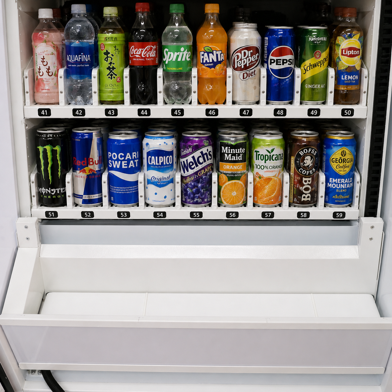
| Coffee and beverages | Level 1 | Clear brand identity and product visibility at distance drives impulse purchase |
For a full breakdown of how branding intersects with machine specification and cost across these categories, the custom vending machine pricing guide covers cost by category including branding-specific line items. And if you are still working through the broader buying decision before getting into branding specifics, the complete custom vending machine buyer guide covers every evaluation stage from product fit through to manufacturer selection.
Branding strategy cannot be finalized in isolation from placement strategy. The same wrap that communicates premium brand identity in a well-lit hotel lobby reads entirely differently in a low-light corridor or an outdoor installation subject to direct sunlight.
Confirming placement environments before briefing your designer - not after - means your branding decisions are made with the actual visual conditions your machine will operate in. Vplaced provides placement analysis that identifies optimal locations for your machine based on foot traffic data, customer demographics, and environment characteristics - giving you the environmental context your brand brief needs before design work begins.
A custom vending machine branding strategy is a planned approach to applying brand identity across every visible and interactive layer of the machine - exterior wrap, screen UI, LED lighting, and payment interface - so the machine functions as a brand touchpoint, not just a dispensing unit. A strong strategy covers all three levels: exterior visual identity, screen and interface design, and experiential activation where appropriate.
A full commercial vinyl wrap with Pantone colour matching typically costs between $800 and $2,000. Custom screen UI design ranges from included in the machine cost to an additional $500 to $2,000 depending on complexity. Cabinet powder coating or specialty finishes range from $2,000 to $5,000 or more. Total branding investment for a mid-range deployment typically runs $1,500 to $4,000 on top of the base machine cost.
Pantone matching is a standardized colour system that ensures your brand colour reproduces identically across every surface, every print run, and every location. Without Pantone specification, colour accuracy varies between suppliers and production runs - causing visual inconsistency that erodes brand trust at the point of sale. For operators running multiple machines, Pantone is the infrastructure of fleet-wide visual consistency.
Yes. Vinyl wraps are designed to be replaced without affecting hardware. Screen UI and digital content can be updated remotely via cloud management on connected machines - pricing, promotional content, and brand imagery can all be refreshed without a site visit. Most operators refresh wraps every 2 to 4 years or in line with major campaign changes.
The most common mistakes are: using low-resolution artwork that degrades at large print sizes, failing to specify Pantone codes leading to colour drift across locations, overloading the wrap with text rather than leading with visual brand identity, and treating the screen UI as an afterthought while investing heavily in the exterior wrap. Both layers must be designed to the same standard.


Share:
How to Choose the Best Vape Vending Machine: A Buyer's Guide
How Do Pokemon Vending Machines Work? Complete Guide